Toonn: know what's home before you buy it again
It starts with a fridge door.
You come home with a bag of groceries, open the fridge to put them away, and there it is: the exact thing you just bought. Already there. Half gone off.
I kept hearing this story from friends, and nobody told it as a problem. It was just a slightly annoying thing that happens every week. When something goes wrong every week and everyone shrugs, there's usually a design problem hiding underneath. This is the story of chasing it.
The problem wasn't what I thought
My first guess was simple: people waste food. The numbers were bigger than I expected. But nobody throws food away on purpose. They throw it away because they forgot it was there, and the same forgetting is why they buy soap they already have.
How do I stop people wasting food?
Why don't people know what's already at home?
So I looked at what already existed. I found more than twelve apps trying to fix this, and almost all of them asked for the same thing.
A barcode on every item
A plastic bag from the market, no labels at all
Finding Pui
A gap isn't a person, though. Before I drew a single screen, I needed someone to design for.

{{ pw.v }}
The moment everything depends on
So I followed Pui through an ordinary week. The obvious place to step in was when she finds the spoiled food. But by then it's too late. The loop has to break much earlier.
The earliest point turned out to be the riskiest one: right after shopping, when she has to tell the app what she bought. That's exactly where her last pantry app lost her. If this step feels like homework even once, she's gone, and nothing else I design will matter.
Small enough to survive
It was tempting to design everything: scanning, recipes, meal plans, shared households. But Pui had already quit one app that asked too much. So I wrote down five things Toonn had to be good at, and every screen had to serve at least one.
Every way it can go
A flow that only works on a good day isn't finished. For each core flow I drew the happy path first, then the other ways in, then every decision point where it can go wrong — and made sure each branch ends on a real screen, never a dead end.
Getting things in
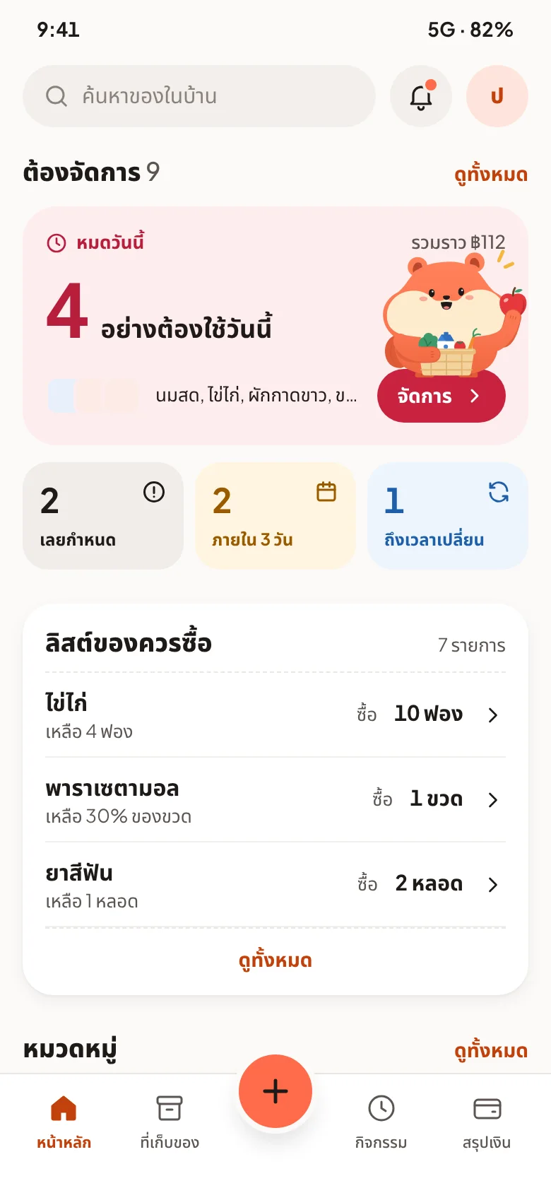
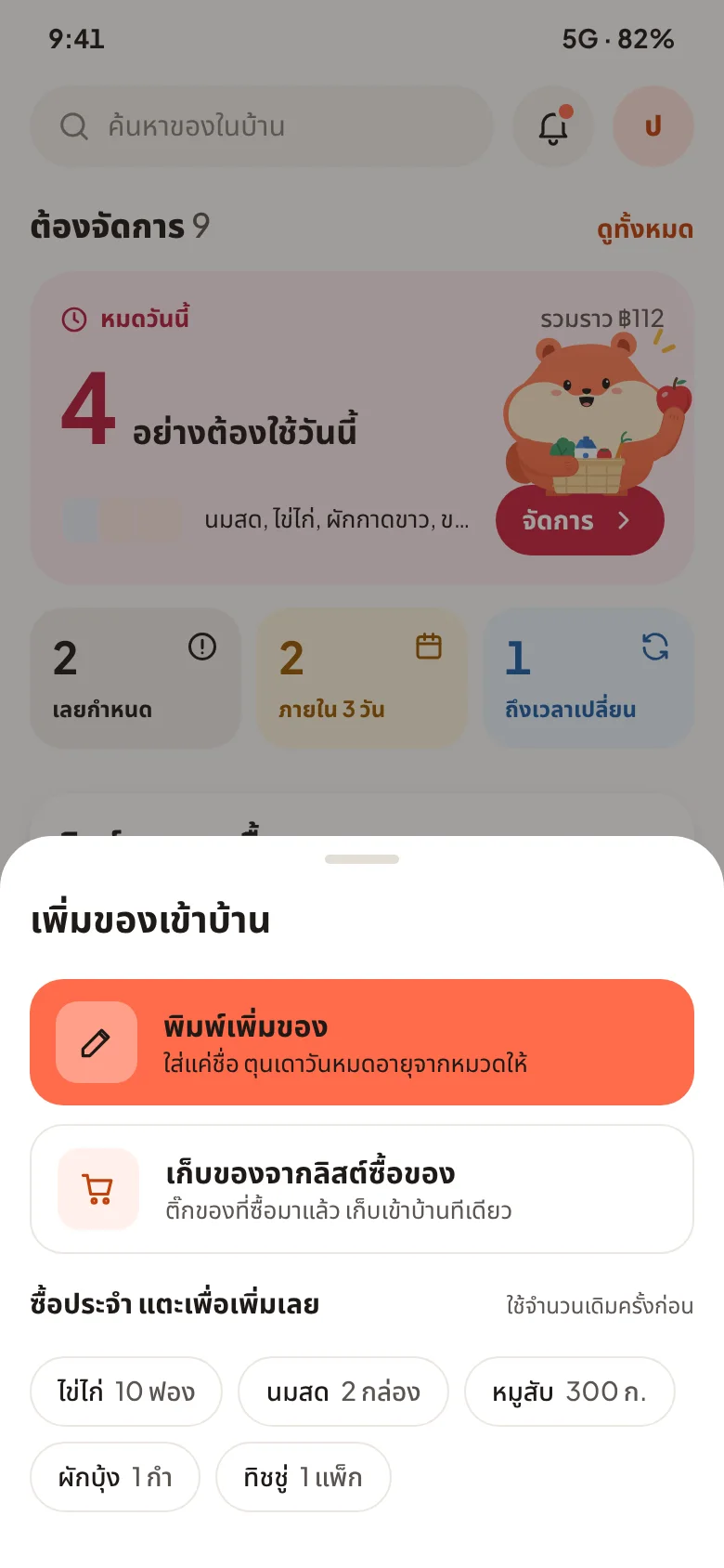
After shopping, record what came home in seconds.- Every add shows a toast with undo, so a wrong tap is never permanent.
Checking before buying
In the shop, find out in seconds whether it's already at home.Closing the loop
Use it up, or admit it went bad — without feeling judged.- Added by mistake? Delete asks why first — a mistake is removed, a spoiled item is routed to "went bad" so the money stays honest.
Making it feel like home
With the structure in place, I had to decide what Toonn should feel like. A clean, clinical look felt like a spreadsheet for your fridge; a loud, playful one shouted over the things that mattered. Warm is the one that stuck.
Why coral?
It wasn't a mood-board pick. Every colour has one job, and coral had to stand out without ever looking like a warning.
It needed a voice
The screens were warm now, but every reminder still sounded like a system: "3 items expiring." And the hardest messages, like "you threw this away", sounded like a telling-off.
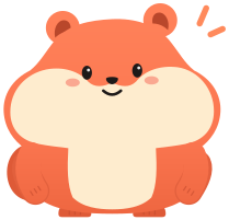
So Toonn got a character: a coral hamster with full cheeks, because nothing says "stocking up" like a hamster. The housemate who remembers everything and never nags.
Why a hamster?
I also sketched a living storage jar and a soft round blob. Only the hamster says "ตุน" from its silhouette alone: it literally stuffs its cheeks to store food for later, so full cheeks became its signature.
{{ ch.v }}
The first draft
I started in grey: boxes, lines and labels, no colour at all. I only wanted to know whether the structure held up. Could Pui get from "I just got home" to "everything's put away" without thinking?
Then came colour, and a few rounds of drafts. Money cards sat near the top. Adding lived in two places at once, as a tab and as a floating button. Later versions tried a "fridge health" score and a little sentence on every storage card. Custom storage places were planned as a paid feature.
On paper, it ticked every box. Then I looked at it the way Pui would.
Seeing it through Pui's eyes
I pictured her in the kitchen at seven in the evening, phone in one hand, and went through every screen asking one thing: would Pui, tired after work, actually get this?
A week with Pui
So what does all this feel like in real life? Let's follow Pui through one week with Toonn.
Remember the fridge door? This is what it looks like when it stops being a surprise.
Back to the fridge door
Looking back, I started out thinking the problem was remembering expiry dates. It turned out to be one small moment: getting the shopping in when you're tired and your hands are full. Almost every screen in this project bends around that moment.
Success isn't downloads.
It's whether people are still adding stock after 30 days, because if adding feels easy, everything else in this story works.
What I'm taking with me
The first draft had everything. The better version said no to a health score, sentences on every card and a paid feature. Each cut made Pui's evening a little easier.
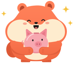
"You wasted ฿21" stings. From a hamster that never scolds, it's a nudge instead of a guilt trip, so opening the app never feels like being told off.
Asking "would Pui get this at 7 pm?" settled arguments that a feature list never could.
The fridge door will still hold surprises. I just want them to be the good kind.